


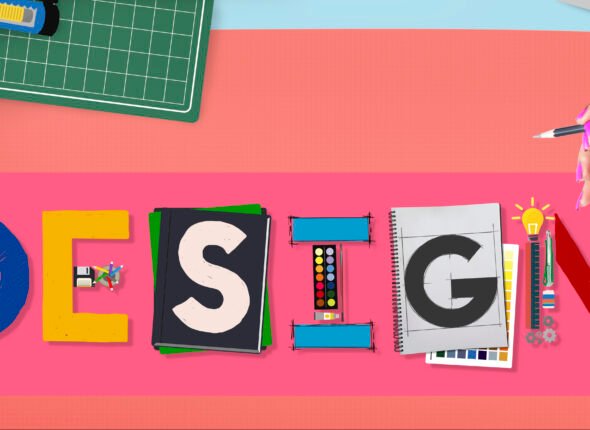
Introduction to Bootstrap 5.3
Bootstrap is one of the most popular and widely-used front-end frameworks for building responsive, mobile-first websites and web applications. In this course, we will dive into Bootstrap 5.3, the latest version of this framework, which brings a host of new features, enhancements, and updates to make web development faster and more efficient.
Whether you’re a web development beginner or a seasoned professional looking to stay up-to-date with the latest trends, this course will teach you how to effectively use Bootstrap 5.3 to build sleek, modern, and fully responsive websites with ease.
What You’ll Learn:
Introduction to Bootstrap 5.3: Understand the basics of Bootstrap, its structure, and why it is a go-to framework for creating responsive websites.
Responsive Grid System: Learn how to use Bootstrap’s grid system to create layouts that adjust seamlessly to any device size, from desktops to tablets and smartphones.
Bootstrap Components: Discover a variety of built-in components, such as buttons, forms, cards, navigation bars, modals, and more, that can be used to add interactivity and style to your website.
Customization with Utility Classes: Learn how to customize elements using Bootstrap’s utility classes for spacing, colors, typography, and more, without writing a single line of CSS.
Flexbox and Grid Layouts: Master the use of Flexbox and CSS Grid in Bootstrap 5.3 for creating flexible and complex layouts.
New Features in Bootstrap 5.3: Get hands-on experience with the latest features and improvements, such as enhanced form controls, better customization options, and improved support for JavaScript plugins.
By the end of this course, you’ll be able to build fully responsive, visually appealing websites using Bootstrap 5.3, and understand how to leverage its features for faster development and better results.
If you’re ready to level up your web development skills and make your websites shine across all devices, this course will give you the tools and knowledge to do just that. Let’s start building responsive websites like a pro with Bootstrap 5.3!
What Will You Learn?
- ### **What Will I Learn?**
- In this course, you will learn how to:
- 1. **Understand the Basics of Bootstrap**:
- * Learn what Bootstrap is and how it helps in building responsive and mobile-first websites.
- * Master the grid system and layout structure that Bootstrap provides to make your websites adaptable to any screen size.
- 2. **Utilize Bootstrap Components**:
- * Understand how to implement a wide variety of pre-designed components like buttons, forms, navigation bars, modals, carousels, and more.
- * Learn how to customize these components to fit your project needs.
- 3. **Work with Forms**:
- * Learn how to create interactive forms using Bootstrap’s form controls, input groups, and validation features.
- * Apply custom form validation to ensure that user input is accurate and error-free.
- 4. **Design Responsive Layouts**:
- * Learn how to create flexible and responsive layouts that adjust seamlessly across different devices, from desktops to mobiles.
- * Work with containers, columns, and breakpoints to structure content effectively.
- 5. **Integrate Utilities for Customization**:
- * Gain proficiency in using utility classes to control spacing, alignment, and visibility, as well as other layout adjustments.
- * Customize the design elements for your project with Bootstrap's built-in options for colors, typography, and components.
- 6. **Bootstrap Themes and Customization**:
- * Learn how to implement Bootstrap themes to enhance the appearance of your websites.
- * Understand how to customize Bootstrap to create unique designs while retaining its responsive nature.
- By the end of this course, you will be able to design modern, responsive websites with ease using Bootstrap’s powerful tools and components.
Course Content
Introduction to Bootstrap 53
In this course, you will learn how to master Bootstrap 5.3, a powerful front-end framework that simplifies building responsive, mobile-first websites. From understanding the fundamentals of Bootstrap to creating flexible layouts with the grid system and Flexbox, this course covers everything you need to create modern, responsive web designs.Key takeaways include:Responsive Grid System for creating layouts that adapt to various screen sizes.Bootstrap Components like buttons, forms, and navigation bars to enhance your website’s design and interactivity.Customization using utility classes to style elements without writing custom CSS.Mastering Flexbox and CSS Grid for advanced layout control.Exploring new features in Bootstrap 5.3, such as improved form controls and better customization options.By the end of the course, you'll be equipped with the skills to build sleek, professional websites that look great on all devices, utilizing the latest tools in Bootstrap 5.3.
Class 02:Bootstrap History
00:00Class 3 Whats new in Bootstrap 5
00:00Class 4:Basic Terminology
00:00Class 05:How to Install Bootstrap
00:00
Layout
Layout Summary in Bootstrap
Bootstrap’s layout system is built around a flexible grid system that allows developers to create responsive designs. The layout is based on containers, rows, and columns:Containers: These are the outermost wrappers for the content. There are two types: .container (fixed-width) and .container-fluid (full-width).Rows: Inside containers, rows are used to group columns. A row ensures that columns align properly and maintain their grid structure.Columns: Columns inside rows define the layout. Bootstrap’s grid system uses a 12-column layout, allowing columns to span a specific number of units (from 1 to 12). Columns adjust automatically for different screen sizes, thanks to the responsive design built into the grid.Responsive Breakpoints: The grid system supports different screen sizes (extra small to extra large), ensuring that your layout adapts to mobile, tablet, and desktop devices.
Class 06:Breakpoint
00:00Class 07:Container
00:00Class 08:Grid
00:00Class 09:Column
00:00class 10:Gutters
00:00
Components
Components Summary in Bootstrap
Bootstrap provides a wide range of pre-designed components that help speed up web development and ensure a consistent design across applications. These components are ready-to-use and customizable, saving you time and effort in creating common UI elements. Here are some of the key components:Navbar: A responsive navigation bar for site menus, logos, and links. It adapts based on the screen size, providing a seamless experience across devices.Cards: A flexible and extensible content container used to display information like text, images, or links in a box-like structure, often with optional header and footer.Modals: Overlays used to display content (like forms, alerts, or dialogs) that require user interaction without navigating away from the current page.Buttons: Pre-styled buttons that come in various colors and sizes. They are used for actions like submitting forms or triggering other interactive elements.Forms: Includes a set of pre-designed form elements like input fields, labels, checkboxes, and radios for easy form creation with built-in validation.Alerts: Message boxes used to display feedback, such as success, error, or warning notifications.Dropdowns: Menus that display additional options when clicked, useful for navigation or selection actions.These components help you quickly build well-structured, responsive, and accessible websites with Bootstrap’s pre-built, customizable elements.
Class 11:Accordion
00:00class 12:Alert
00:00Class 13:Badge
00:00Class 14:Breadcrums
00:00Class 15:Button
00:00Class 16:Button Group
00:00Class 17:Card
00:00Class 18:Carousel
00:00Class 19:Collapse
00:00Class 20:Dropdown
00:00Class 21:List Group
00:00Class 22:Modal
00:00Class 23:Navbar
00:00Class 25:Navs Tabs
00:00Class 25:Offcanvas
00:00Class 26:Pagination
00:00Class 27:Placeholder
00:00Class 28:Popover
00:00Class 29:Progress
00:00Class 30:Scrollspy
00:00Class 31:Spinner
00:00Class 32:Toast
00:00Class 33:Tooltip
00:00
Content Styling
### **Content Styling in Bootstrap****Content Styling** in Bootstrap allows you to easily format and style textual content, images, and other elements within your layout. Bootstrap provides a wide array of utilities and components that enhance the presentation of your content, ensuring it is responsive and visually appealing across all devices.#### **Key Features:**1. **Typography Utilities**: Bootstrap offers a set of classes for adjusting text size, font weight, alignment, and line height. Classes like `.text-center`, `.font-weight-bold`, `.display-1`, and `.lead` help you control text styling efficiently.2. **Text Colors**: You can customize text color using contextual utility classes such as `.text-primary`, `.text-muted`, `.text-success`, etc., which adjust the color based on your design needs.3. **Backgrounds and Colors**: You can style backgrounds of sections, rows, or individual elements with classes like `.bg-primary`, `.bg-light`, `.bg-dark`, and others. These help add contrast and focus to specific content areas.4. **Spacing Utilities**: Bootstrap provides padding and margin utilities (e.g., `.p-3`, `.m-2`) for controlling the spacing around and within elements, ensuring a consistent layout.5. **Lists and Tables**: Bootstrap includes predefined styles for lists, table formatting, and responsive tables to help organize data and present information cleanly.6. **Images and Media**: With utilities like `.img-fluid` for responsive images, `.rounded` for rounded corners, and `.media` for flexible media objects, you can easily integrate and style media within your content.7. **Responsive Design**: All of Bootstrap's content styling is designed to be responsive, ensuring your content looks great on both small and large screens.#### **Common Use Cases:*** Formatting headings, paragraphs, and body text for readability.
* Styling tables and lists for better organization and presentation of data.
* Creating responsive layouts for images and media.
* Adding visual hierarchy and emphasis to text and sections with typography utilities.#### **Benefits:*** Simplifies the process of styling content across different devices.
* Ensures consistent and attractive visual presentation with minimal effort.
* Provides flexibility for custom design tweaks using utility classes.Bootstrap’s **content styling** utilities offer a quick, powerful way to improve the presentation and readability of your website, enhancing both user experience and design consistency.
Class 35:Images
00:00Class 36:Tables
00:00Class 34:Typography
00:00Class 37:Figures
00:00
Working with Form
### **Working with Forms in Bootstrap**Bootstrap simplifies the creation of forms with a set of responsive, easy-to-style components. It provides a range of form controls, such as text inputs, checkboxes, radio buttons, and select dropdowns, all styled with the `.form-control` class for consistency and responsiveness.Key features include customizable form layouts using `.form-group` and `.form-row`, input field sizing with `.form-control-sm` or `.form-control-lg`, and built-in form validation using `.is-valid` and `.is-invalid` classes for visual feedback.Bootstrap also allows for custom form controls, such as checkboxes and switches, and offers layout utilities like grid-based rows and columns for complex forms.These features ensure forms are easy to build, style, and adapt to different devices while maintaining consistency across designs, making them ideal for contact forms, registration, and more. Bootstrap streamlines form creation, saving time while ensuring responsiveness and accessibility.
Class 38:Form Control
00:00Class 39:Select
00:00Class 40:Checkbox Radio Button
00:00Class 41:Range
00:00Class 42:Input Group
00:00Class 43:Floating Label
00:00Class 44:Layout
00:00Class 45:Validation
00:00Websites Like A Pro
A course by
Student Ratings & Reviews

 Lessons:


